I am sure you have seen clever ads that help your brain think a different way, and clear ads that are upfront and even blatant sometimes.
This article’s purpose is to touch on some of the merits and pitfalls between them, and do a light B2C case study on how sacrificing the confused customers for the high-intent customers was achieved through clarity.
What’s the difference?
The fastest way to communicate the difference between them is with real-life examples.
Here is an example of Clever
Notice how talented the designer was, truly a master of their trade. One slight problem with clever ads, although beautiful, they tend to be confusing.
In this example I thought it was a dog ice-cream cone… after some thought about “true colors” and what that might mean, I started to see what was intended for me to see, a dog with the end of a colored pencil for a backside. my thoughts then went to how the poor dog could stand on only two legs, and if the dog was balanced correctly for the pencil-butt mutation… and so on.
While beautifully designed and even with a “feeling” in mind, this ad might cause high intent users to mis-interpret what the original message was meant to be.
Here is an example of a clear ad:
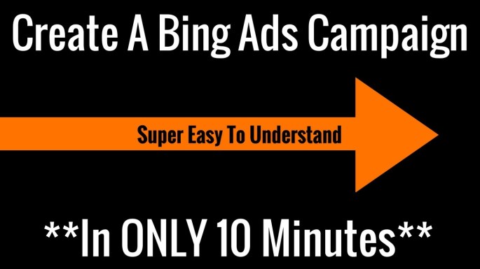
What am I supposed to do with this information? ah, create a bing ad… and look it’s only going to take me 10 minutes! I can spare 10 minutes to make my business better ya know?
The downside to clarity is it usually is not a lot of fun for talented designers. Agencies and internal stakeholders alike are likely to be more interested in clever ads over clear ads, because “clever” tends to be close buddies with “beautiful”, and while we want everything we do to be as beautiful to others as it is in our own heads, they will not see what they need to see to appreciate our “genius” if we do not make clarity a higher priority over clever and beauty.
The Case Study
While working for a B2C company, we had a desire to be more up-front about who the customer was working with when they used our site. There was a problem with this as the method for acquiring traffic to the site was just as ambiguous as the site and less likely to change in the short term.
Even though everyone was worried about website conversion rate plummeting, we ran the test anyway.
We ran the test to be reasonably sure we would not hurt conversion rates too much. To facilitate this specific need, we ran the test for 2 weeks looking to achieve 80% statistical confidence.
The control page kept images, text, and placement focused on the ambiguity the user started with in the search results.
The treatment page eliminated with great prejudice the ambiguity by adding text, and changing images and content to draw more attention to who the user was working with and these are the learnings that came out of it.
Learnings
We saw about 2% decrease and 80% confidence, in users going from the landing page to the checkout page. Sad day right? after all, the changes we made were 100% on the landing page, so the story is over right? WRONG!
We found a that as we tracked the rest of the funnel, there was an increase in users completing the checkout process.
14.15% increase in users completing a sale at a slightly higher average order value and the best part is… it was at a 96.29% confidence level.
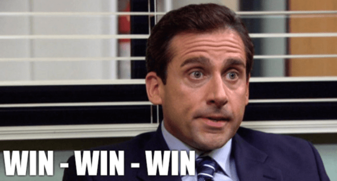
That is what I call a
- The objective to be more open with our users was achieved
- We prevented a loss in conversion rates and even saw a substantial increase
- We learned that we CAN focus on the right customers through clarity in our offers
Conclusion
By keeping the message clear long before we consider beauty and cleverness, we can create a conversation that the right customer can understand. They can then chose for themselves if what we are offering them is the best choice for them, instead of trying to persuade them with clever concepts and fancy designs alone.
And now I end with one of my favorite quotes by Flint McGlaughlin “Clarity trumps persuasion”.
